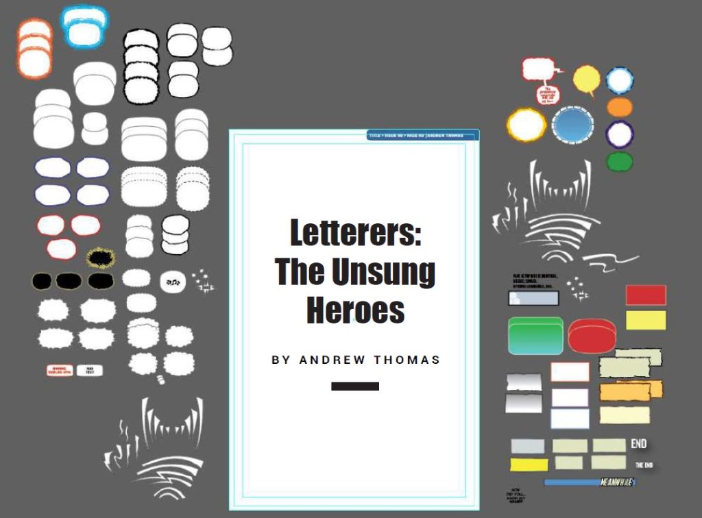
BY ANDREW THOMAS
For nearly a century, comic books have been an important part of popular culture. With visually stunning art and compelling narratives, they have shaped the way we tell stories. While artists and writers frequently receive the majority of the attention and praise, there is a group of professionals who work tirelessly behind the scenes, significantly contributing to the visual and narrative impact of comics. These unsung heroes are letterers, the people who add dialogue, captions, and sound effects to comic book pages.
Lettering is more than just putting words on a page; it is a subtle art form that has a significant impact on a comic’s overall reading experience. Letterers must select fonts, sizes, and styles that complement the
story and artwork, ensuring that the text blends seamlessly with the visuals. They are responsible for ensuring that the dialogue and narrative flow are easy to follow, making the story accessible and engaging.
As a letterer, I was given invaluable advice, highlighting the fact that excellent lettering goes largely unnoticed. No matter how stunning the artwork is, poor lettering can detract from the reader’s immersion. Lettering, as a distinct art form, necessitates seamless integration with the visual narrative,
creatively contributing to the overall storytelling experience.

Letterers also add sound effects to comic book panels, such as “BAM!” or “ZOOM,” to make action sequences come to life. These onomatopoeic expressions are not only informative but also artistic elements that add to the story’s mood and pacing. A well-placed and creatively designed sound effect in a comic book can heighten the impact of a punch, explosion, or other action.
Lettering in comics has a fascinating history, with significant changes and developments over the years. The evolution of lettering has paralleled the evolution of the comic book medium itself, from the early days of hand-drawn lettering to the digital age of today.
Hand-Lettering in the Golden Age
The practice of lettering was quite different from what we see today during the Golden Age of comics, which lasted from the late 1930s to the early 1950s. During this time, the same artists who drew the comics also did the majority of the lettering. While this approach provided some cohesion between the art and the lettering, it also meant that lettering quality varied greatly from artist to artist.
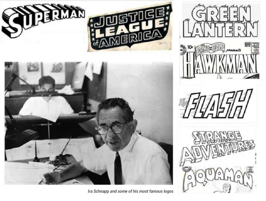
In comparison to modern standards, the hand-lettered style of the Golden Age was frequently rudimentary. The limitations of the medium restricted letterers’ use of uppercase letters and their techniques. Despite these constraints, lettering from this era has a nostalgic appeal, and some of the early lettering pioneers, such as Ira Schnapp, made significant contributions to the field.
The Rise of Professional Letterers in the Silver Age
The way lettering was handled changed as the comic book industry grew and matured during the Silver age (late 1950s to early 1970s). Professional letterers began to emerge as a distinct subset of the industry’s talent. These letterers were not always the same people who created the artwork, and they brought specialized skills to the craft.
During this period, the art of lettering began to evolve into more sophisticated and varied styles. Letterers experimented with various fonts, giving rise to some iconic lettering styles. Artie Simek’s playful and distinctive lettering for Marvel Comics during the Silver Age, for example, contributed to the brand’s identity.
Technological Advancements in the Bronze and Modern Ages
The Bronze Age (1970s–1980s) and subsequent Modern Age of comics witnessed technological advances that had a significant impact on lettering. Traditional hand-lettering techniques began to fade in favor of digital techniques.
The introduction of computer technology and design software in the late twentieth century transformed the lettering process. Letterers made the transition from hand-lettering on paper to digital lettering on computer screens. This shift improved the craft’s precision and flexibility. Digital lettering enabled letterers to quickly correct mistakes and experiment with fonts and styles by allowing for easy revisions.
Collaboration and Efficiency in the Digital Age
The comics industry’s current digital age has continued to reshape the art of lettering. Digital lettering has become the industry standard, bringing with it a slew of advantages.
For starters, digital lettering has made it easier for letterers and creators to collaborate regardless of their geographical location. This has resulted in more efficient workflows, faster turnaround times, and improved communication.
Digital tools have expanded the creative possibilities for letterers. They can now easily change font sizes, styles, and placement to tailor the lettering to the needs of the story. This has resulted in more dynamic and expressive lettering that adds to the artwork and narrative in novel ways. I personally prefer the use of Adobe Illustrator for my lettering work.
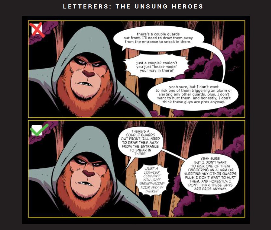
Lettering is essential to a comic book’s pacing and tone. It directs the reader’s attention to the most important elements of a page and aids in overall storytelling. By adjusting the size and style of the text, a skilled letterer can enhance the emotional impact of a scene, creating an atmosphere that complements the narrative. They also collaborate closely with artists and writers to ensure that the text matches the story’s intended tone and flow.
Furthermore, letterers are critical to keeping a comic book series consistent. They ensure that the speech patterns and fonts of the characters are consistent throughout the publication, which is critical for reader immersion.
Discussions around crediting and recognition are constantly evolving in the dynamic world of comic book creation. While the names of artists, writers, and even colorists are frequently found on the front covers of comic books, one important contributor often remains in the background – the letterer.
Traditionally, comic book covers prominently featured the names of artists and writers, with nods to inkers, colorists, and editors on occasion. However, letterers’ credits are frequently relegated to the interior pages, typically in smaller font sizes. This traditional hierarchy has sparked a growing debate within the comic book community about the perceived undervaluing of letterers and whether it’s time for a credit reevaluation.
Advocates for including letterers on the front cover argue that their contributions are just as important to the success of the comic book as those of artists and writers. They argue that letterers should be treated as integral members of the creative team, with equal billing on the cover. They argue that this shift would
not only recognize the artistic merit of lettering but would also raise awareness about the collaborative nature of comic book creation.
Some argue, on the other hand, that the current credit hierarchy reflects the industry’s traditional division of labour. They argue that, while letterers undoubtedly contribute to the finished product, the front cover should be reserved for those regarded as the story’s primary architects – the artists and writers. This
viewpoint frequently stems from a long-standing tradition that emphasizes narrative conceptualization and execution.
“Who buys a book for the letterer?” is a question that’s possibly crossing your mind. “It’s unprecedented.” In response, I argue that the industry has historically focused on praising writers and artists, inadvertently overlooking the importance of behind-the-scenes contributors. By elevating the recognition of these often-overlooked roles, readers may be enticed to purchase books specifically because of the skilled lettering that enhances the overall comic book experience.

Andrew Thomas is an award-winning Comic Book Artist and Letterer from Brantford, Ontario. As an illustrator, has done interior and cover art for Dark Horse Comics, Secret Stash Press, Lev Gleason, Archie Comics, and other independent publications. His most notable achievement was winning the Favorite Artist and Favorite Comic Book awards at the Canadian Independent Comic Book Wiki Awards for his acclaimed and co-created Canadian comic series, Auric of the Great White North.
Follow him on Instagram @thefatmanwholetters
As a Comic Book Letterer, Andrew has worked on over 150 publications for publishers including Disney, Archie Comics, BOOM!, Image, and Dark Horse, where he is working on new comics from writer/director, Silent Bob himself, Kevin Smith!